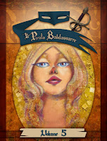
I have 4 different alternatives and I currently torn between the last two.
One breathes more but the other one helps the figure stand out better.
Maybe I should have "variant" edition! ha haha

I've had this Klimt inspired cover in mind for Pea since the very beginning.
The pose kinda stuck with me (I used a similar one for "air").
It's one of those images you see and can't quite get rid of until you materialize them.
So here it is.


I personally really like the ones that help Pea stand out. So that would be the first and last one (but I'm not sure which ones you have already decided you liked?)
ReplyDeleteThe others look nice too, but she kinda just seems to melt into the background. I really like the contrast between the darker, almost almondy color and the bright gold.:)