Elianthos was asking on Deviant Art about "color schemes".
I mentioned somewhere before, I can't remember where because I answer to questions in so many different places, that I decided to use certain color schemes for the characters and their covers.
It's not like I am applying gestalt color theory to these, that would make them too subtle and complicated, right?
Let's say, though, that many years of designs and color theories cannot be completely wiped off my mind after I took a color&design class with Alana Addison - who was some sort of a boot-camp teacher (thank God). So I am not ignoring Tornquist and Itten.
Mah, complicated stuff, but it's there in the back of my mind... if you want to pick at it a little more let me know.
In the meantime I'll explain what I meant when I said I am applying color schemes to the characters.
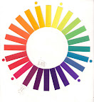
What you see here is a cholor wheel! Actually two of them.
I painted these myself long time ago. To paint one means to explore color and get to make its acquaintance and befriend it... you don't paint one... you are neighbors, maybe, but not completely friends.
The one to the left is a complete color wheel made with design gouache, the one to the right is a 12 steps - simplified version - of the previous one. Colors across the way from each other on a color wheel are called complementary colors. If they meet in the middle you get a grayish tone but richer hue. Let's take the yellow/green on the top and the rose tyrien/magenta on its opposite.
That's what you get when these complementary colors meet.
Skin tone! :D As you can see when complementary colors meet and marry they have nice kids, that's why they are called complementary: they make good weddings and lots of gorgeous babies.
But what happens if daddy works far away from home and mommy lives across the color wheel with the her kids?
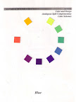
Let's say mommy is blue and all her kids look like her so they have a little bit of blue in them and live in a big family called: the blue family.
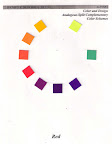
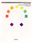
So does the yellow family and so does the red family. These are the 3 biggest families currently living on the color wheel, btw.
Let's go back to mommy blue. She lives with all her kids from yellow/green to red/violet who all have blue in them, because their mama is blue. So mommy is alone and daddy is gone... the complementary/husband to mommy blue should be daddy orange. But daddy orange is too busy and sends his brothers to help. Brother Yellow/orange and brother Red/orange... they look like daddy because they are brothers with Orange and so have a little bit of Orange in them but they are not quite orange.
These types of families are called Analogous (the families) with split (the brothers).
Why using a split instead of a direct complement? It so happens that when you put mommy and daddy together, they love each other so much that they vibrate. Of course you can call this love or after image effect! A color has some sort of radiation, they actually travel in light at different waves length and are perceived in different ways by people.


Ever wondered why, if you are shortsighted you see red better than green? Well it's because of their wave length. Red has longer ones and reach you better. Anyways... every color casts a vibration around it which is the color of its opposite - they look for a mate right? So yellow would cast a purple shadow around himself: Hello, I am looking for a purple wife!
Wanna try? Well do stare at a yellow square for about 30 seconds, then move your eyes away and look at a white wall. What do you see? Don't you see a purple square? You do, right? Fantastic... that's the after image effect... the luuuuv the color expresses for its complement! LOL
So imagine direct complement standing next to each other, glowing with love... you have these two little shadows fighting: I love you more, no I love you more... and that's why you get a vibration and daddy sends his brothers instead. Daddy doesn't want to fight with mom and his beloved kids. Uncles are just uncles and they don't vibrate quite as much.
These are the types of scheme Disney Studios used for their movies in the past 20 years. My favorite color scheme was applied to The Huntchback of Notre Dame... it's the jewels scheme... family of blue with gem like colors and then the oranges working as golds (blue analogous with splits)... it's rich and it's very bright and attracts a lot of attention. It looks stunning and elegant.
It just makes you drool and makes you feel warm and fuzzy inside.

It's the scheme applied for Kes and Wes. Of course, who else could get these colors?
Now Kes and Wes are also dressed in complementary colors: she is yellow and he is purple.
She is the moon and he is the night sky.
They live across the color wheel and when they are close together they vibrate quite a lot! XDDD
That's the concept behind the fact that they are wearing what they are wearing and their clothes never change colors! Shapes they change... colors they cannot.
Now... if we were to apply this concept to the other couples/characters... what would you say the message is?


Fangirling for the glorious Jewel&vibrating couple aside, thank you very much for this post =^_^= .
ReplyDeleteLoved the analogies you chose XD.
About Lio&Foxy, warm&cold shades of the same 'family'... she brings him excitement, he brings her solace... and they happily mingle on their common middle ground XD? [Code Message: Aye Aye Marvin Gaye]