Yes, partially.... meaning... I use Illustrator and Photoshop interchangeably since I have a Cs4 and can work on vectorial object from photoshop to illustrator... how comfy!
But how do I draw a cover? And how long does it take me?
It takes me about an hour and I start from a pencil drawing... always!!!
Illustrator
First of all I open Illustrator and I start my itunes and select some good music I like... Yes, yes, Pirates of Penzance while I draw about pirates seems like the right choice.
Setting up the file.
I import the drawings I mean to use. As you can see the drawing can be rough or very detailed it depends on my whims... mhhh, usually I do detailed backgrounds but I can just rough characters up and still have a clear idea of what I need to do.
I also import the Illustrator file on which I set up colors - meaning... these guys will not change their color, I have set a styleguide and this drawing is MY styleguide for Kane and Castalia.
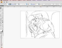
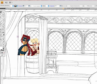
Pencil background, characters and styleguide are on 3 different layers.
I am set to go.
Background
If I need to draw a background I usually stat from there.
I test to see the character's placement and have an idea of how much of this drawing I actually need to draw, then I start from the first element.
The background always goes on its own layer. I use the pen tool, I use objects and merge them with pathfinder... I use stroke and offset paths a lot.
I learned this technique form Hasbro's and Strawberry Shortcakes' vector files... they layer up a lot.
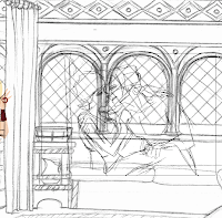
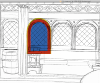
Once I finish one element I duplicate it and offset it to create a regular interval between objects and creating instances is usually the best solution for this. Then I start adding details.
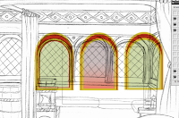
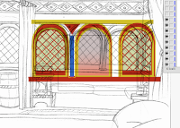
I turn on and off the layer with the drawing to see if the vector drawing works... then add a layer to have the background recede a bit. On a separate layer, using transparency.
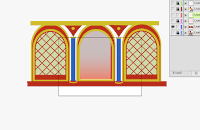
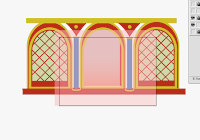
The background is done, I turn off the layer and move onto the next step.
Drawing the characters
Again I check the characters for placement, since creating instances always give you a precise measurement and that, of course, would differ from a pencil sketch. Once the placement and sizing is decided I turn off the background layer and create a new one for my characters.
I use mainly the pen tool to draw the shapes, starting, usually from the basic ones, the ones that go behind details: the bottom layers.
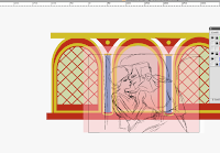
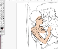
Since I am working bottom to top it does not matter if the shapes aren't following the drawing precisely... they will be covered by the next shape.
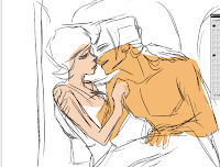
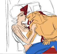
as you can see they overlap nicely. Then when I have to draw details I often switch the drawing's layer off and focus on the shape.
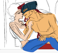

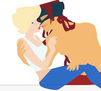
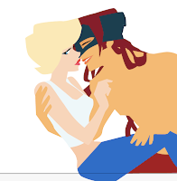
The final touch ups.... the blush is a circular gradient, the earrings are strokes objects.
Double check on features and colors.... mhhh, check!
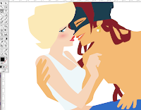
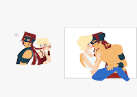
Time to add the brushstrokes. I use a calligraphic brush that I personalize to my liking and God's will - God being my tablet, she has a life of her own... luckily I know how to deal with my moody wacom. So I start drawing the lines.
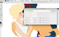
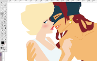
Finish up all the details... and turn on the background again. Tack, tack!
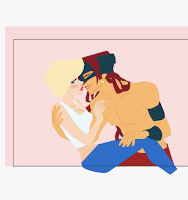
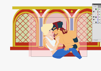
There! They are exactly placed according to my composition. Now it's time to take all this basic drawing and export it to Photoshop.
I do it one layer at the time. Locking everything else, I select all, copy and paste (yes, copy and paste) from Illustrator to Photoshop. The selection automatically becomes a vectorial object in photoshop... means that if I click on the layer, in Photoshop, it will automatically open Illustrator to let me modify the original vector based drawing. *ç*
Photoshop
I open in Photoshop the template file I created so that the cover will always be the same size, same color, same everything. I turn on the parchment layer and throw in the first object from Illustrator, the background and the pink overlay. I play with multiply and transparency to get a nice basic color.
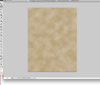
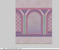
Next I create my torn page effect with a mask and I create a layer that I fill with a pattern and set to multiply - I mask that too - and throw in an overlay with this purplish colors in stripes.
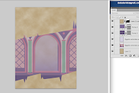

Again I play around a bit with multiply and transparencies and add a purple glow! Then add the burnt edges along the torn part.
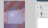
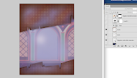
After thaaat.... It's time to throw in our dudes... mask the layer... mhhh it looks dark....
let's throw in a layer with levels. There! Much better.
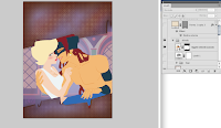
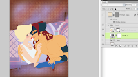
Then I can drop in the logo and the scroll with the title.
They are ready-made-object that live in a GROUP in separate files. I just drop them in the file I work on or turn them on and off. I type the text on the scroll... it has a drop shadow effect.
I use layer effects on some objects, mostly drop shadow though especially on scrolls and fonts.
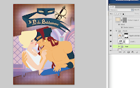
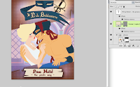
The cover is done!!!! No it's not XDDD... That's not what goes online... what goes online has a
square format and a brown edge. So I need to open my template page for the actual comic pages.... there!
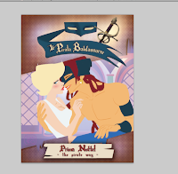
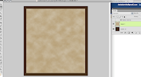
On that file I drop a flat layer with the cover. Then I save the file for the web with the correct size and make a jpeg of it.
Now it's done and ready to go on smackjeeves or be put in indesign or acrobat to do my pdf files for issuu.
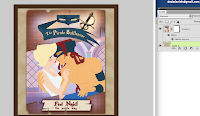
Was this helpful? I think it's boring XD Anyways one thing I can say: by the time I am done so is the Pirates of Penzance and that's how I know how long it takes me... also, this cannot be done with a mouse, you risk a carpal tunnel, you need a wacom - an intuous - that works, unlike mine - and some serious software. I have a Cs4 and find it amazing! Being able to keep a vector object in a psd file is the best thing that ever happen to mankind since sex!


"Being able to keep a vector object in a psd file is the best thing that ever happen to mankind since sex!"
ReplyDeleteXDD!!! I had thought that was Internet, but I suppose I'm talking from ignorance, since I use the Photoshop CS still.
Very interesting post, I like seeing how people work, I think one can learn a lot from it.